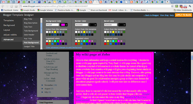
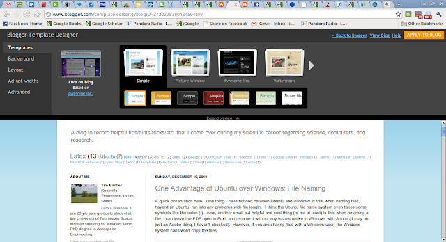
First I have changed my font color and post background color. To me, from what I have mentally gathered, a dark font with a light background or vice-versa works best. I personally like a darker font with a lighter background. This all can be changed easily in the Design Tab in Blogger.
Screenshot from my blog: I guess if you are reading this it probably looks the same, :P.
I had something like this before. It was a darker grey with a yellow tinged font. Not very easy to read...
This one is better, but I think, IMO, it is better not to get too fancy.
And please don't do something like this...it looks like a 14 y/o girl's MySpace or Xanga (sorry, no offense, just not professional). Seriously, I saw a PhD student who was applying for a professorship at my school who presented his equations in this color in a font size of 8...really?
Next I changed the layout. I have a blog archive as one of my gadgets on the sidebar like most people do (it seems pretty standard, and you can see mine in the images and probably now of course). However, I first had the archive gadget in a small width gadget space which crammed it and made it ugly and unreadable.
So I finally figured out you could move the gadget to a wider gadget space in the layout design tab. I also had columns on both sides of the post, but I found it is better if you have one column on one side because it will increase the width of your post area. Also, I like the column on the left because I like to use X-Large picture formats and they spill over on the right side of the site. Even though I figured out you (reader) can click on the image and it will enlarge.
Also, it is nice to use a decent size font. Right now I am using Times Roman at an 16pt. I think in my format it is the perfect size. It is big enough, but not distorted like 18 or above.
Anyways, this post was supposed to be about how to widen your post. I thought changing to the one column format helped a lot. However, I went to the Design tab and under Edit HTML couldn't really follow this blog tip (John Deere Mom: How to widen your columns on Blogger) :
I am going to post some links and screenshots of some examples of what I am talking about. Here is the link again to the one I just mentioned:
John Deere Mom: How to widen your columns on Blogger
See (image above) how she has a simple white background with a black font color. Font is nice a big, very readable. She also has a nice blend of her post area and gadget area. I think this is due to the Design Template. I use the Awesome, Inc.
Here is the Simple:
She also has some (it looks) customized stuff which I haven't gotten to yet but will post about when I get there.
This is a screenshot of Please Make a Note.
Tony also has a very nice layout. Good font, background contrast. Very readable. He also has some nice customized stuff. I also noticed his tab at the top on the internet browser has a blue sphere instead of the Blogger emblem. Got to figure out that trick!!
Well, I just found the adjust width tab under the Design tab. Geez, it couldn't have been any more obvious. Haha, oh man, maybe it's new?? Anyways here are some screenshots:


No comments:
Post a Comment